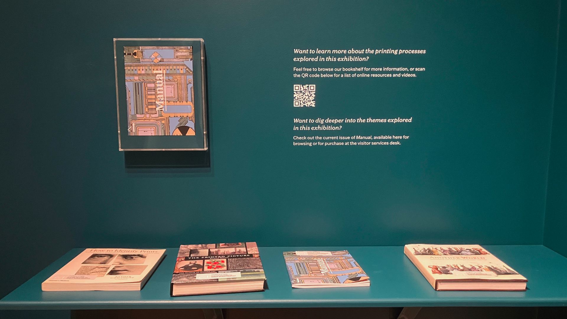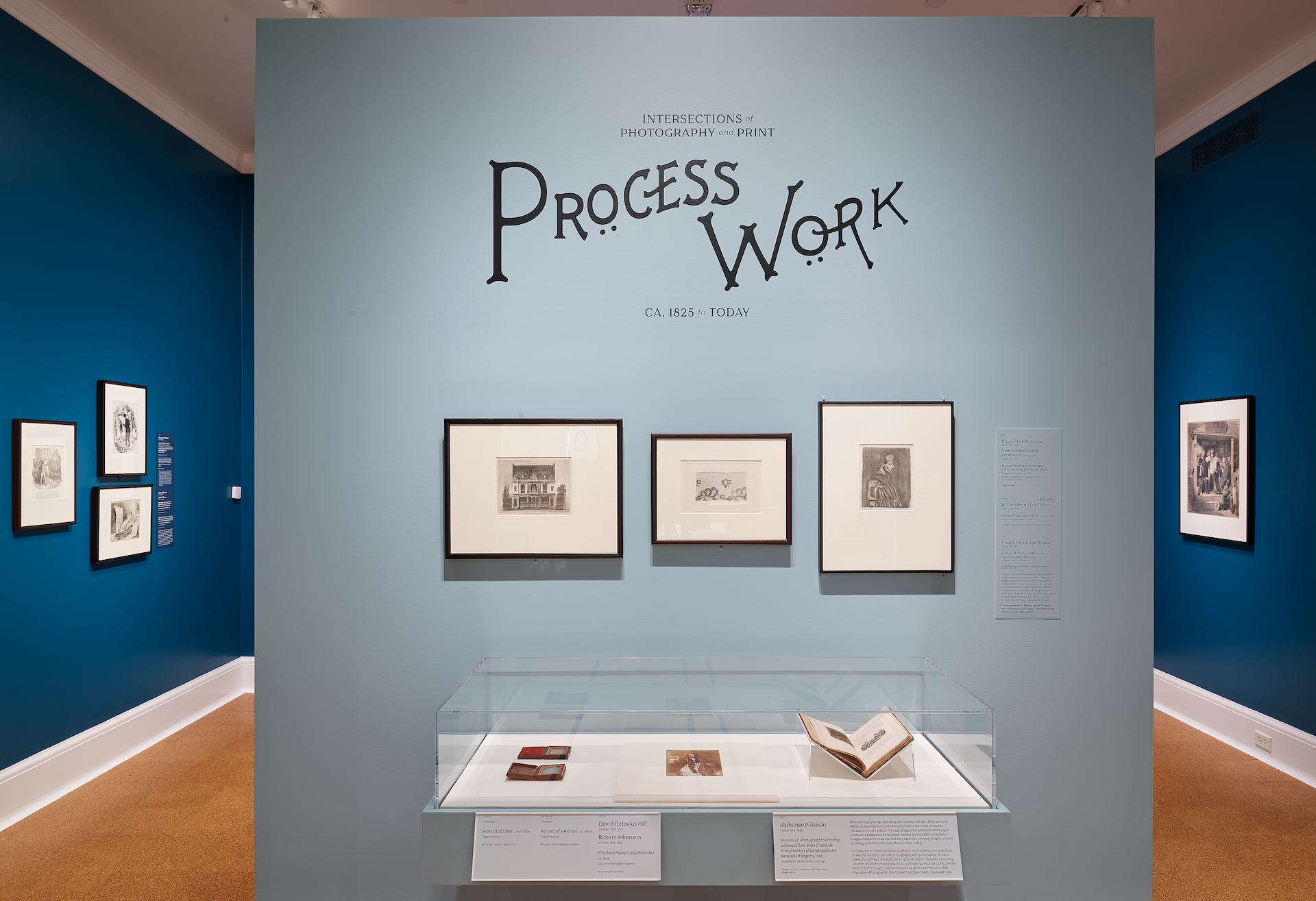
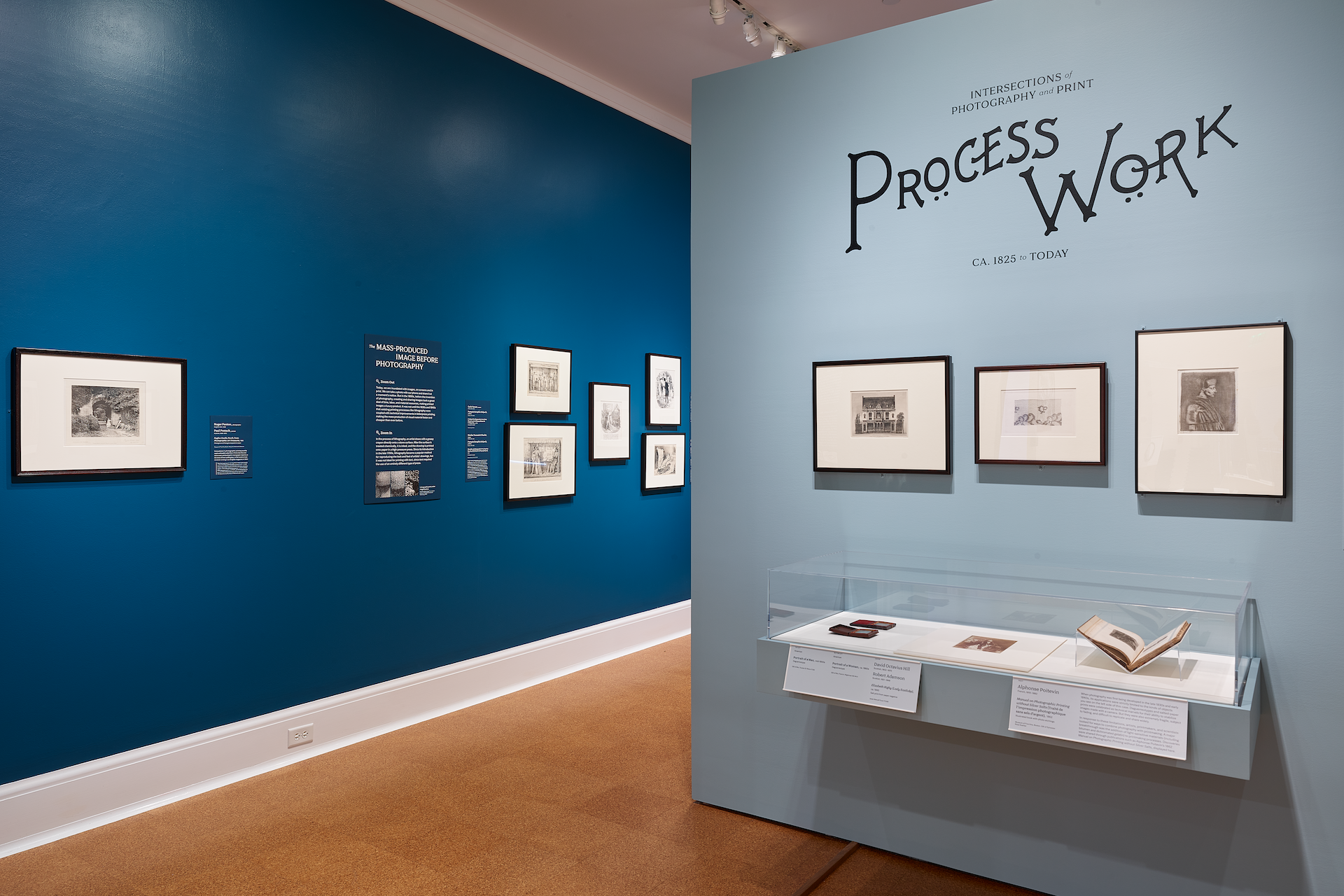
( Digitizing Pröcess Wörk )Sarah Mirseyedi, curator of the exhibition, used the title of the publication Process Work as the title for the show. One issue of the magazine had Arts & Crafts-style lettering which was digitized for the exhibition's decorative word mark.
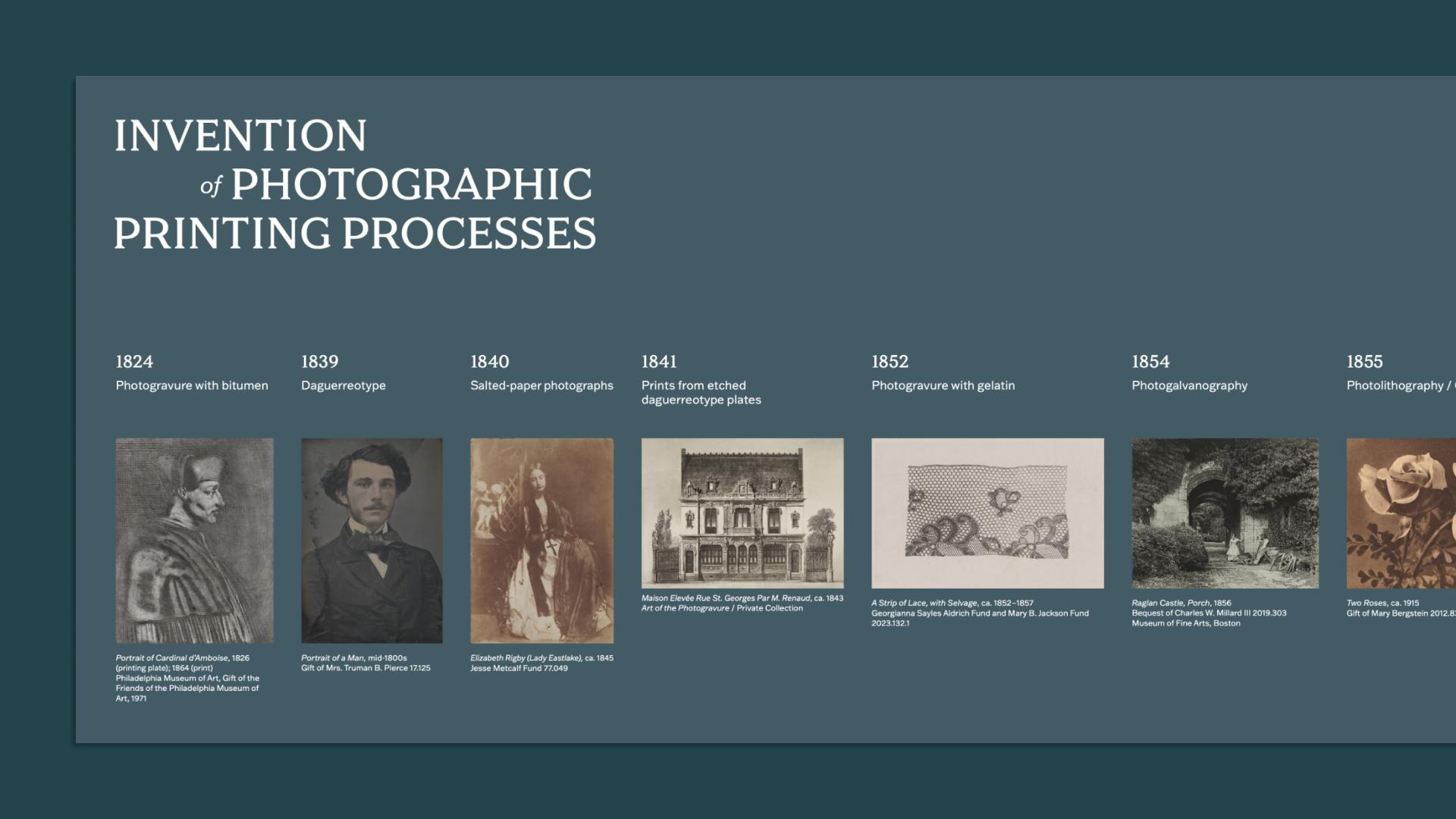
( Timeline )The curator also wanted to provide a brief overview of the wide variety of photographic printing processes that are covered in the exhibition. Each of the artworks listed here correspond with a printing process, a year, and feature a thumbnail image of the representative artwork featured in the show.
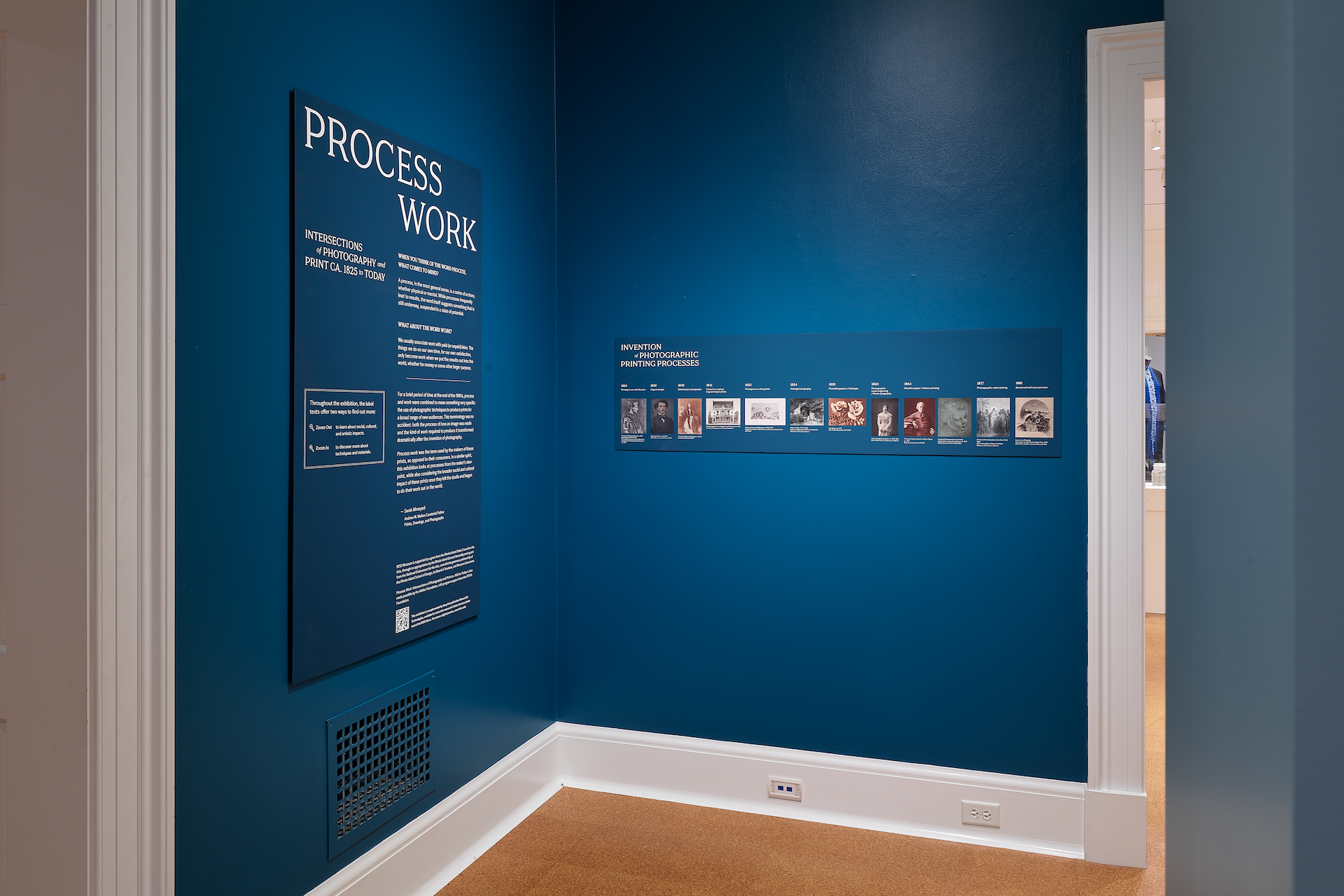
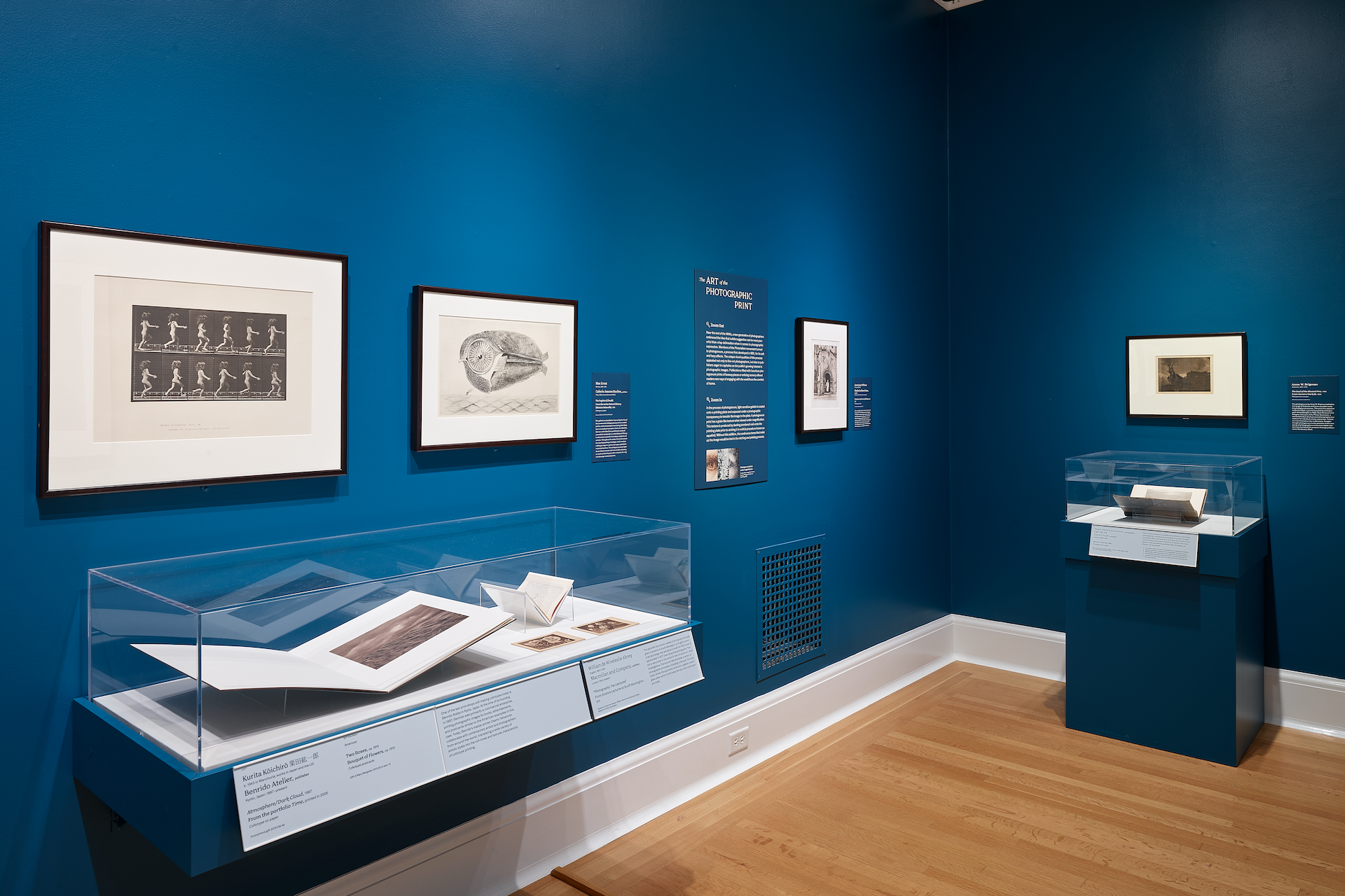
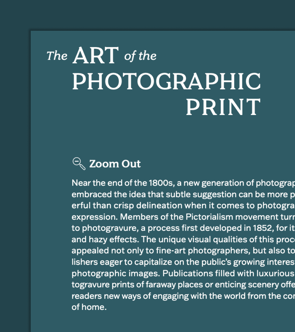
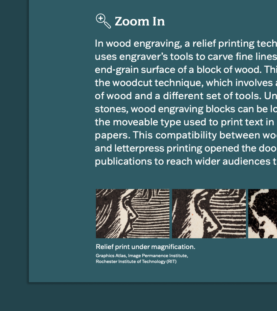
( Wall Chats )The exhibition is divided into numberous sections. Each section has a dedicated wall chat which describes a "zoomed out" view or the historical context, as well as a "zoomed in" view which describes materials and/or printmaking techniques. Each panel has detail views of prints and photographs to accompany the "zoomed in" view.
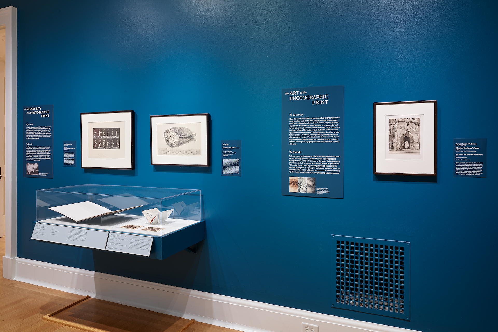
( Object Labels )I also designed object labels that were mounted to the wall as well as affixed to cases. I chose a contemporary, geometric serif typeface that has historical roots. For the body text, I chose a sans serif that is timeless and was commonly used in advisements, newspapers, etc. (relevant mediums in the history of photographic and typographic printing).