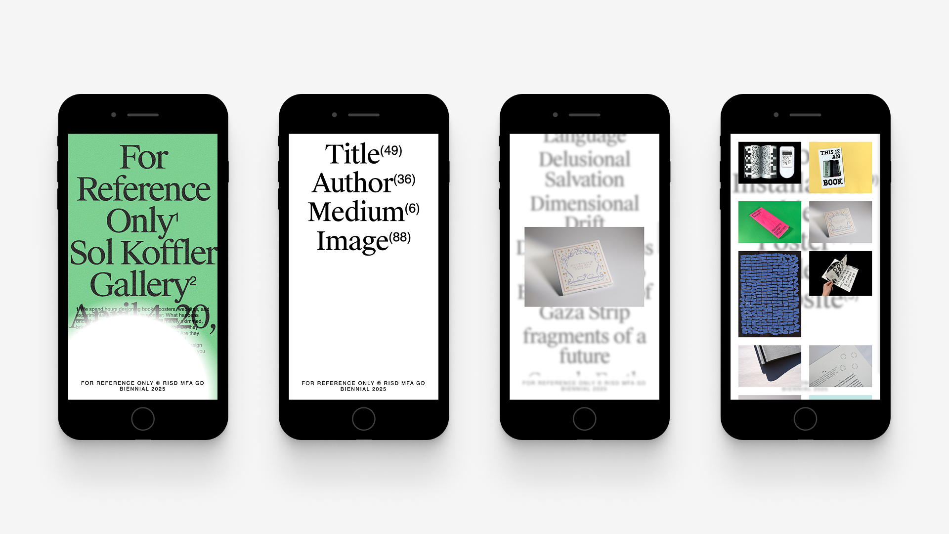
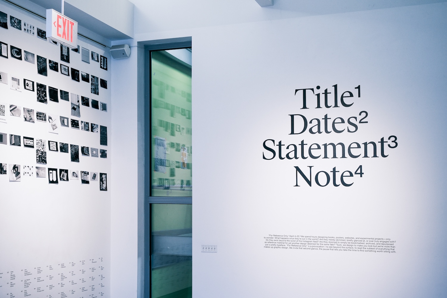
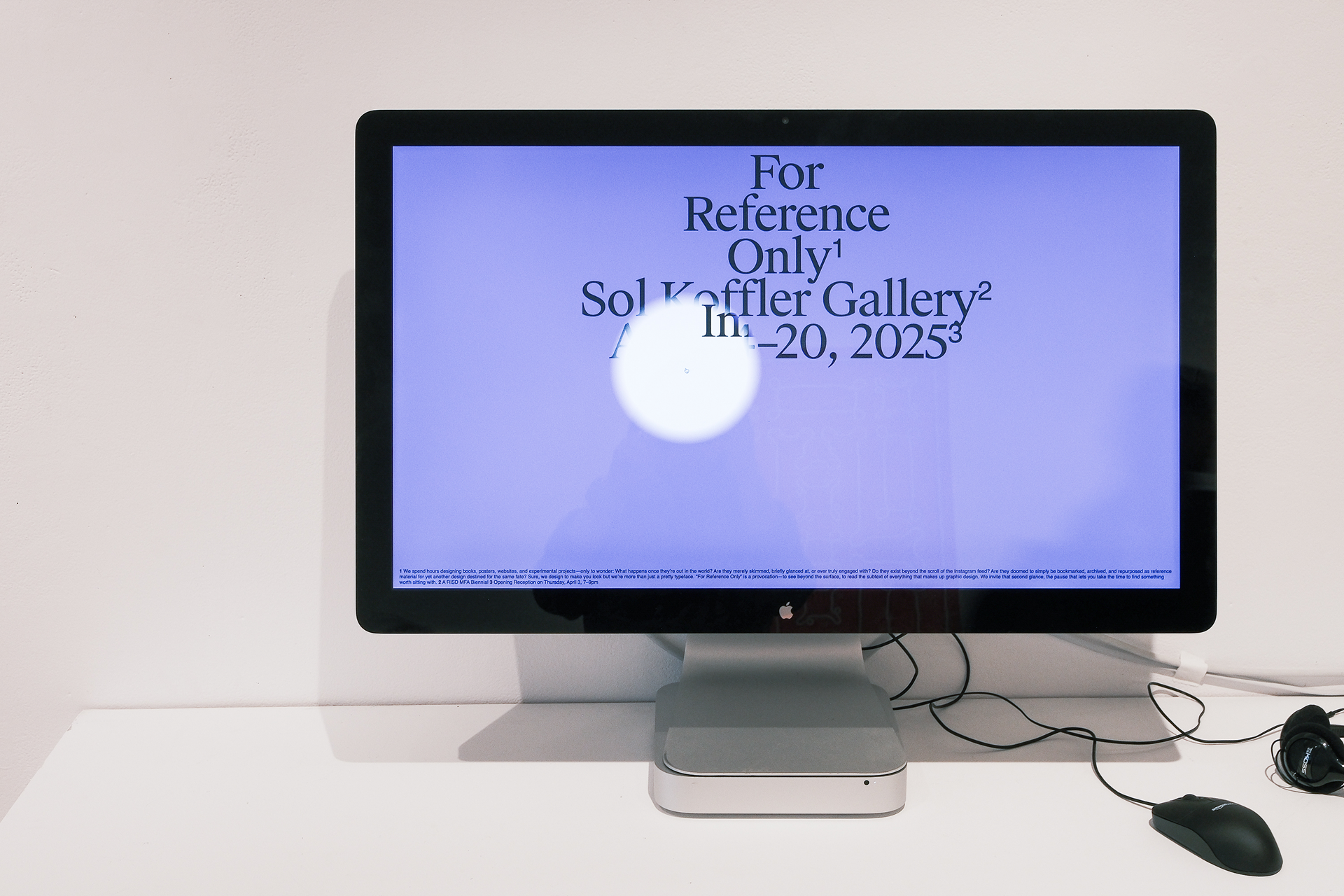
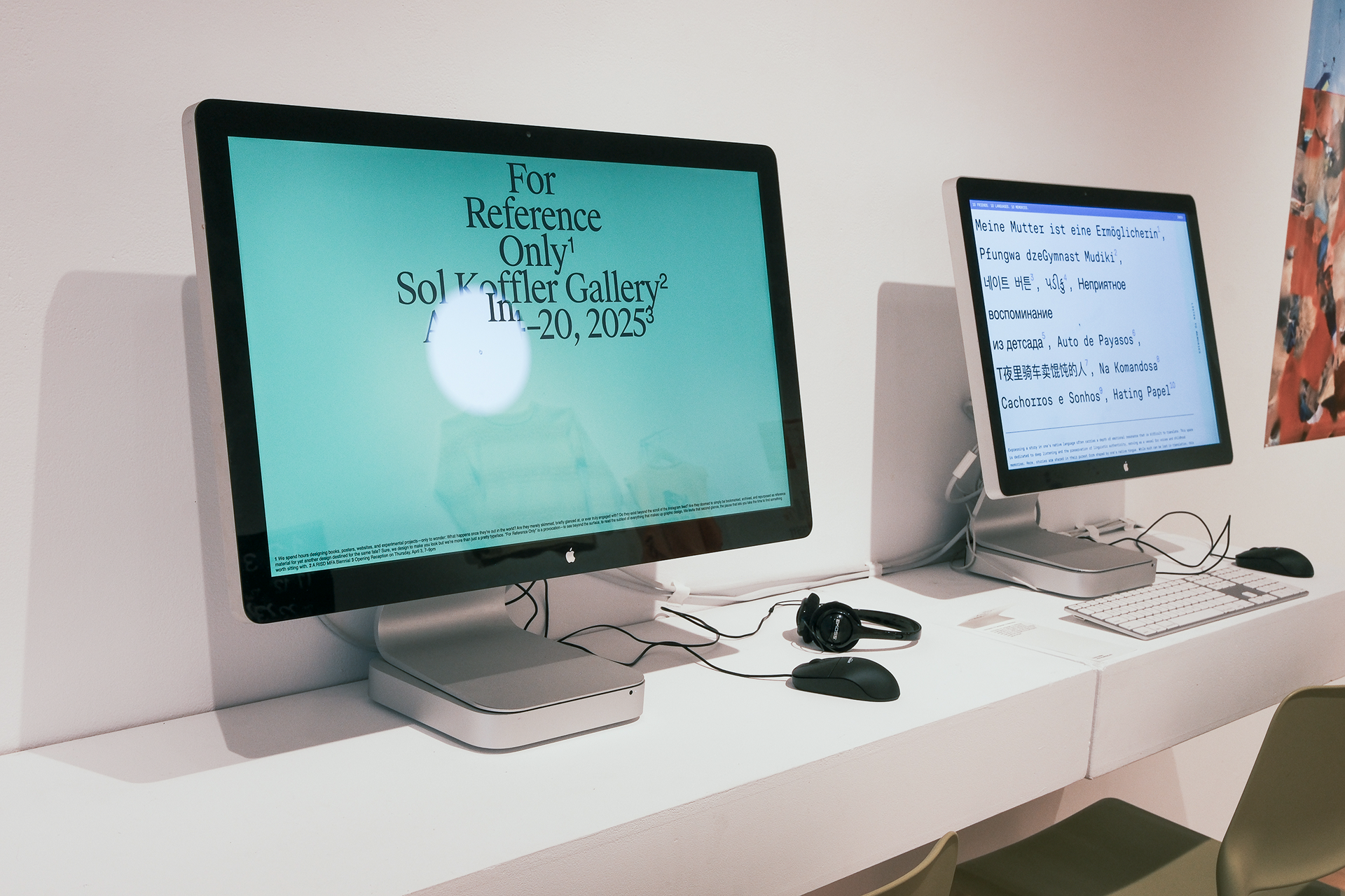
( Personal Contributions )I worked on a team of three designers, including me, Tina Zhou, and Annabel Gillespie. We collaborated together to develop the visual look which mirrored the typographic identity created by the Identity Team. They conceptualized the navigation while I executed it with Javascript (navigation was automatically populated!). I developed the JSON to populate the content, image modals, and mobile views. I also created a cool function to download your own poster.
( Index of Titles, Names, and Mediums )The identity's typographic concept centered around the idea of reference material, hence the use of superscripts. The user can browse via titles, names, and mediums. Or, they can visit the image gallery which contains all of the works.
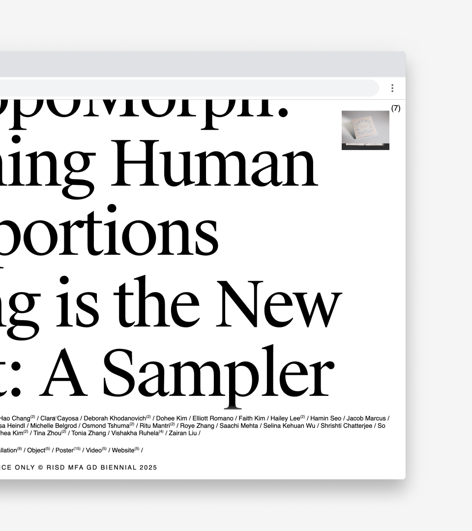
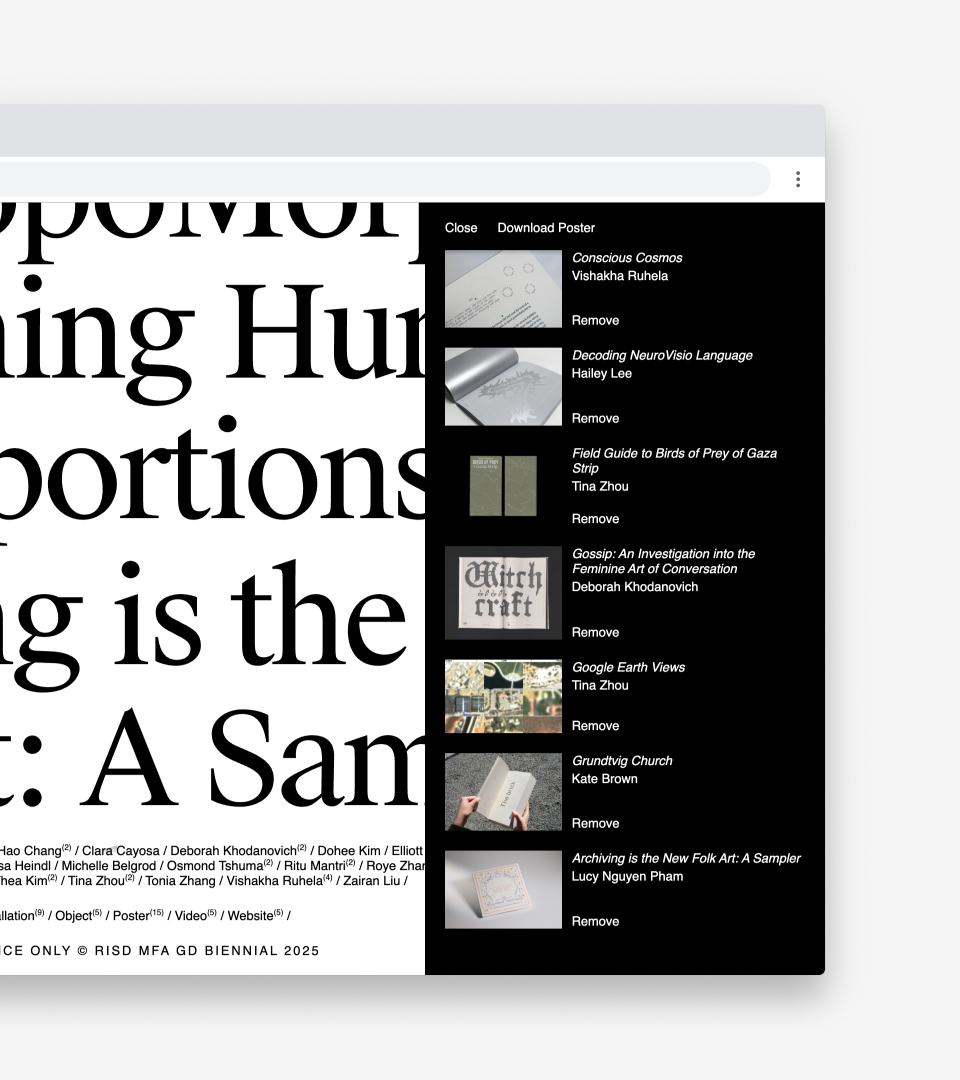
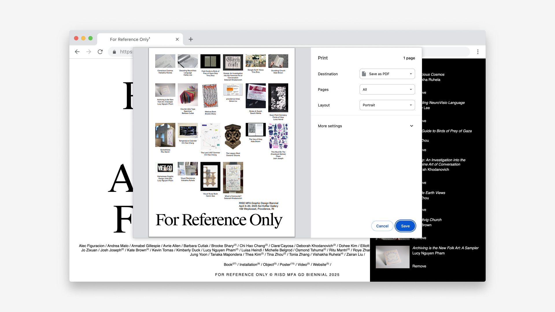
( Poster Generator )One of my favorite parts of the website is the ability to download your own poster! As the user clicks on different titles of works, it gets added to a stack in the corner. Clicking on the stack opens the user's "reference list." They can add and remove posters as they please in order to create a custom reference poster.

( Image Modals )When users click on titles, authors, or mediums, different variations of the image modal appears. For instance, if the user clicks on a title, a single image for that work appears. If a user clicks on an author, an image for all of the works that the author submitted for the exhibition appears. If a medium is clicked, a grid for all of the works in that category appears.
Below is the modal that appears when a user clicks on an author's name, who has two works in the exhibition.
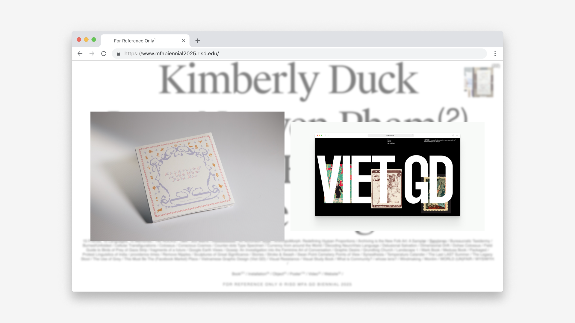
Below is the modal that appears when a user clicks on a medium, showing all of the books in that exhibition.
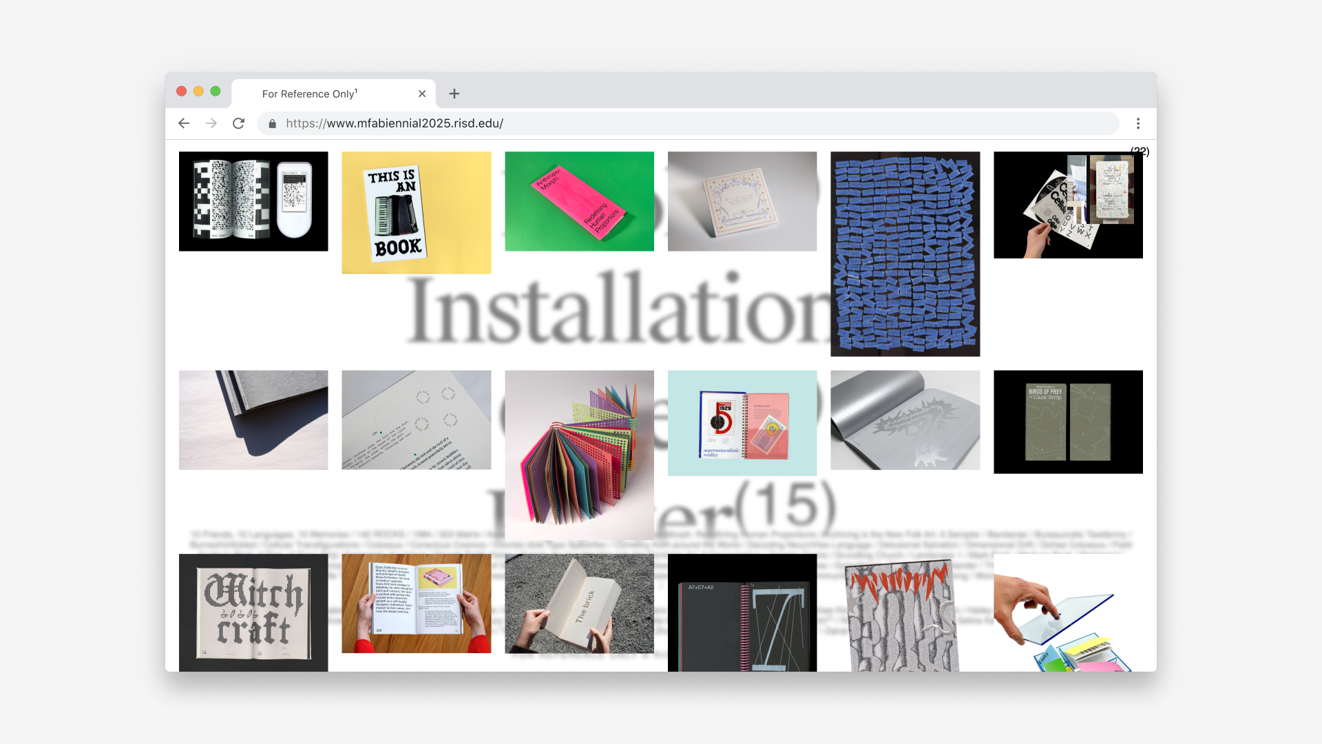
( A Mobile Friendly Website )I also made the website more mobile-friendly while Tina Zhou made the website responsive for desktop. The biggest issue with the mobile version of the website was the circular "cursor" on the landing page because hover isn't enabled on mobile, but I was able to maintain the same aesthetic by animating the circle.
