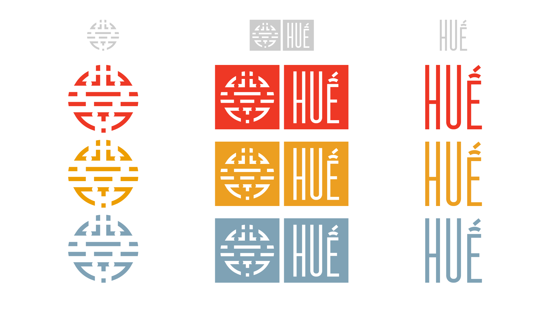
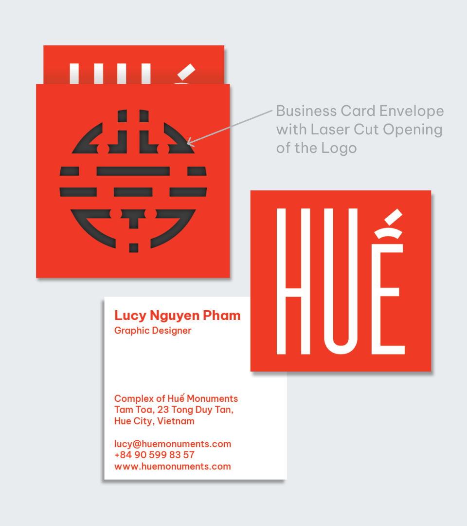
( Logo Development )The mark was inspired by a design found in one of the buildings. The typeface "Westgate," designed by Giang Nguyen, was used for the wordmark to reflect the linear and rounded geometric shapes of the mark.
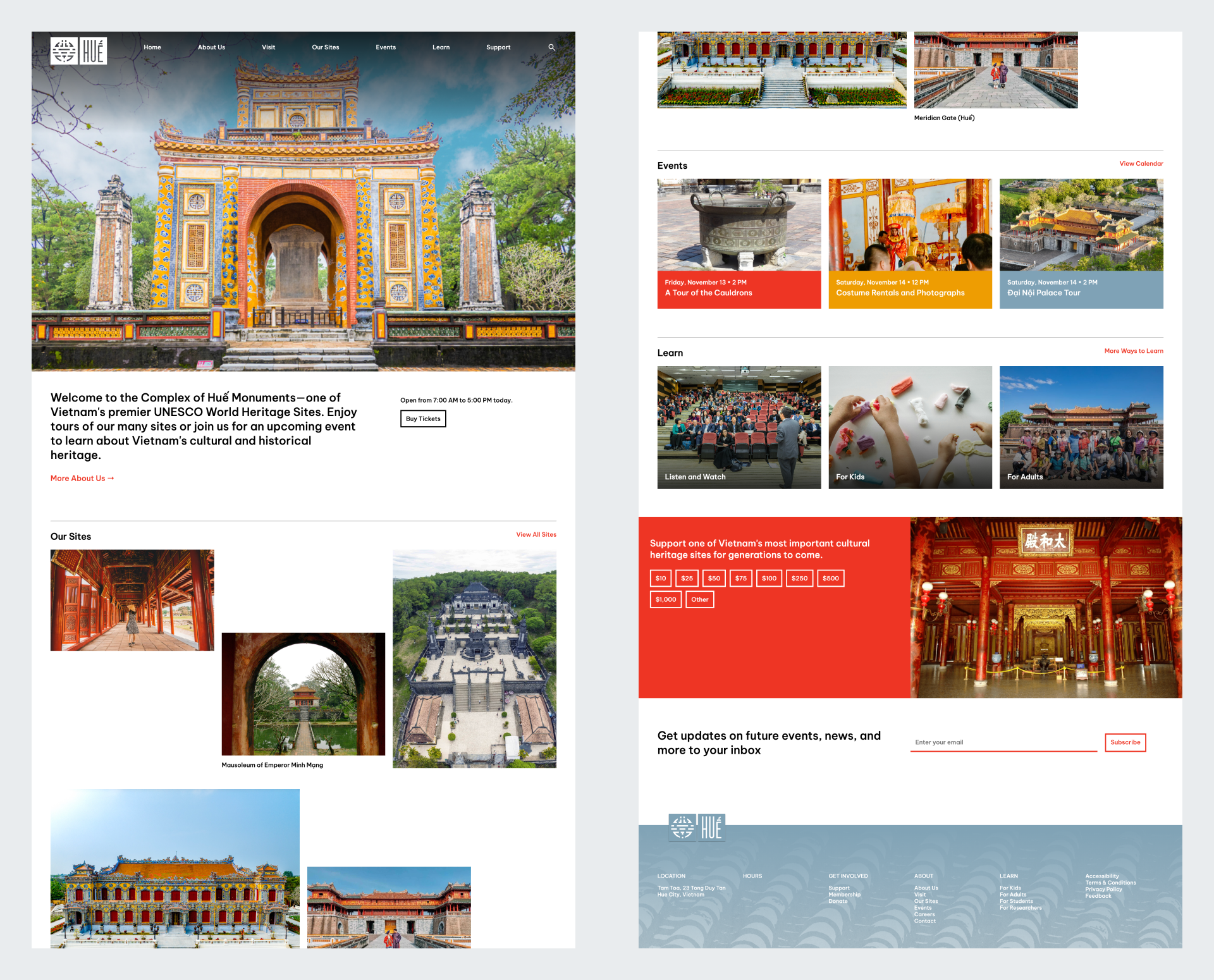
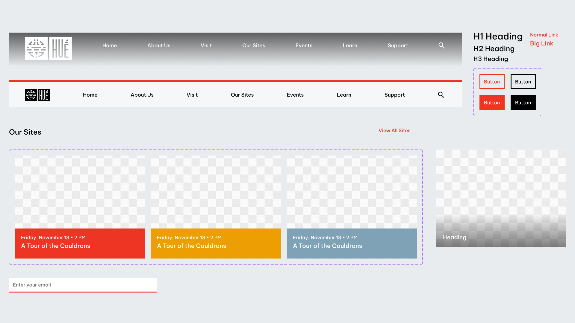
( Website )I designed (and coded!) a homepage, extending the brand's system to the digital space. The homepage quickly introduces the visitor to the Complex's numerous sites, events and programs, and more.
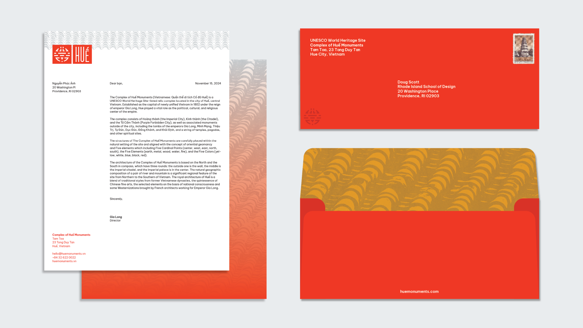
( Website )The letterhead features the brand's roof pattern at the top and a combined roof/gradient texture on the back.
The envelope also features a roof pattern on the inside.

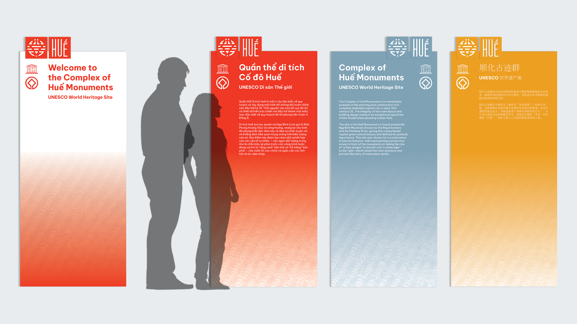
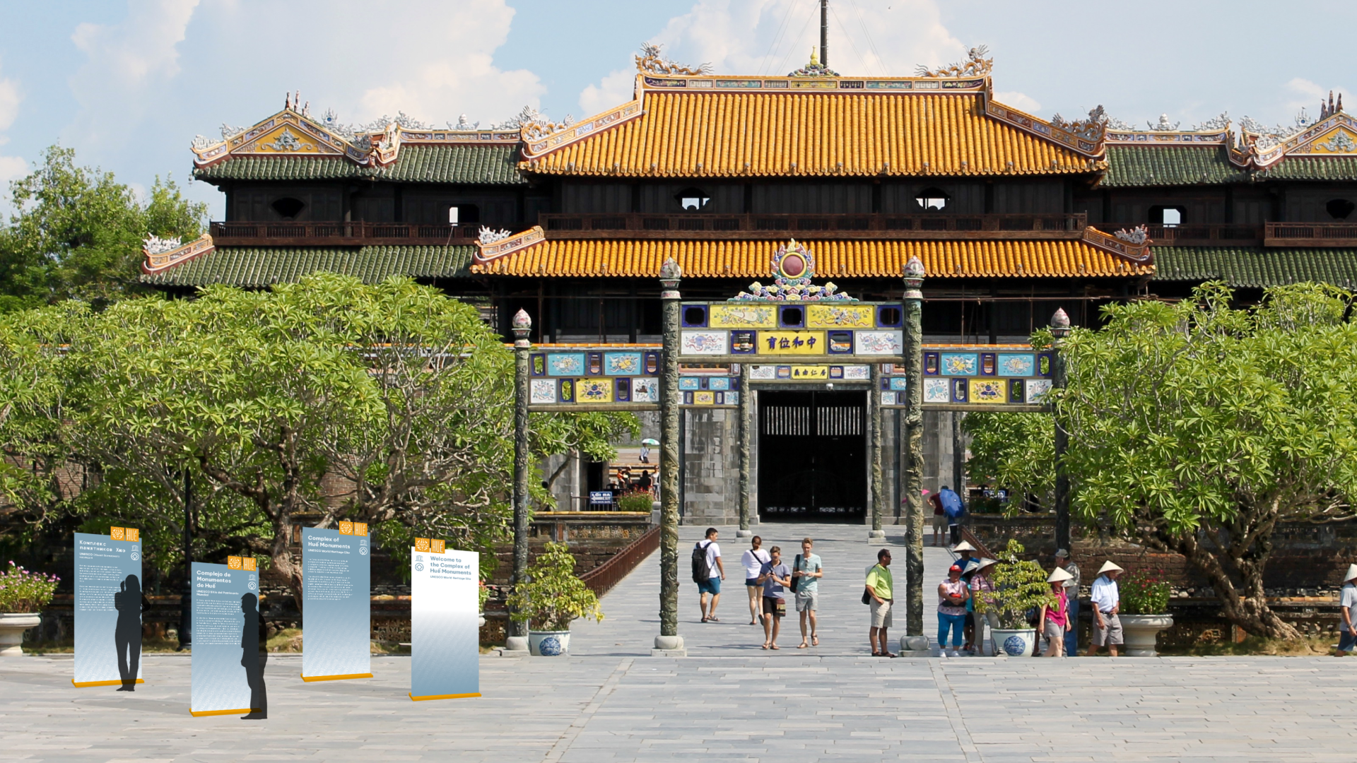
( Signage )I designed a series of site signs in seven languages. Different colors can be used depending on the nearby architecture. The Complex features buildings and monuments in various colors, such as red, yellow, and dark grey. The image below shows a blue and yellow sign near a blue and yellow archway.
