Since 2022, RISD worked with agency Code and Theory to research how students experience RISD’s digital products and how it could be improved. At this time, RISD also had a separate app called myRISD which allows students to "personalize their RISD experience and provide access to campus services and resources at their fingertips."
Code and Theory learned three key ways in which the experience doesn’t currently address their needs which later resulted in the creation of the Student Hub:
In 2024, me and several other students conducted research on the effectiveness of the current 2024 Student Hub, as well as the myRISD App. My research goal was to recognize areas for improvements and determine if there was a need for the myRISD App.
I discovered several pain points after interviewing seven students about the Student Hub and My RISD:
Based on my findings, I ideated a bunch of “how might we” statements but settled on:
How might we help students find the right contacts so they can receive personalized support for their unique and complex problems or needs?
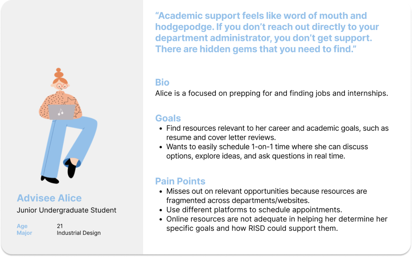
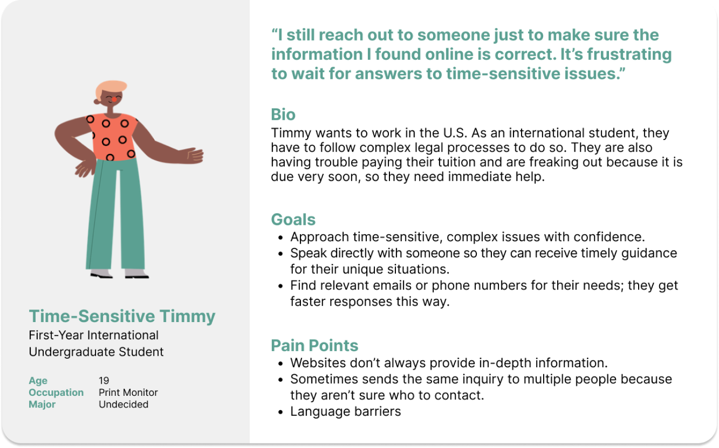
Based on my research, the problems identified, and the users I interviewed, I developed two user personas to guide my future research:
I decided to focus on designing for Alice because my exploratory sketches and user flows demonstrated that she would likely have a more complex user flow. So, if I could design a successful solution for her, then it’s possible that I would solve for Timmy in the process.
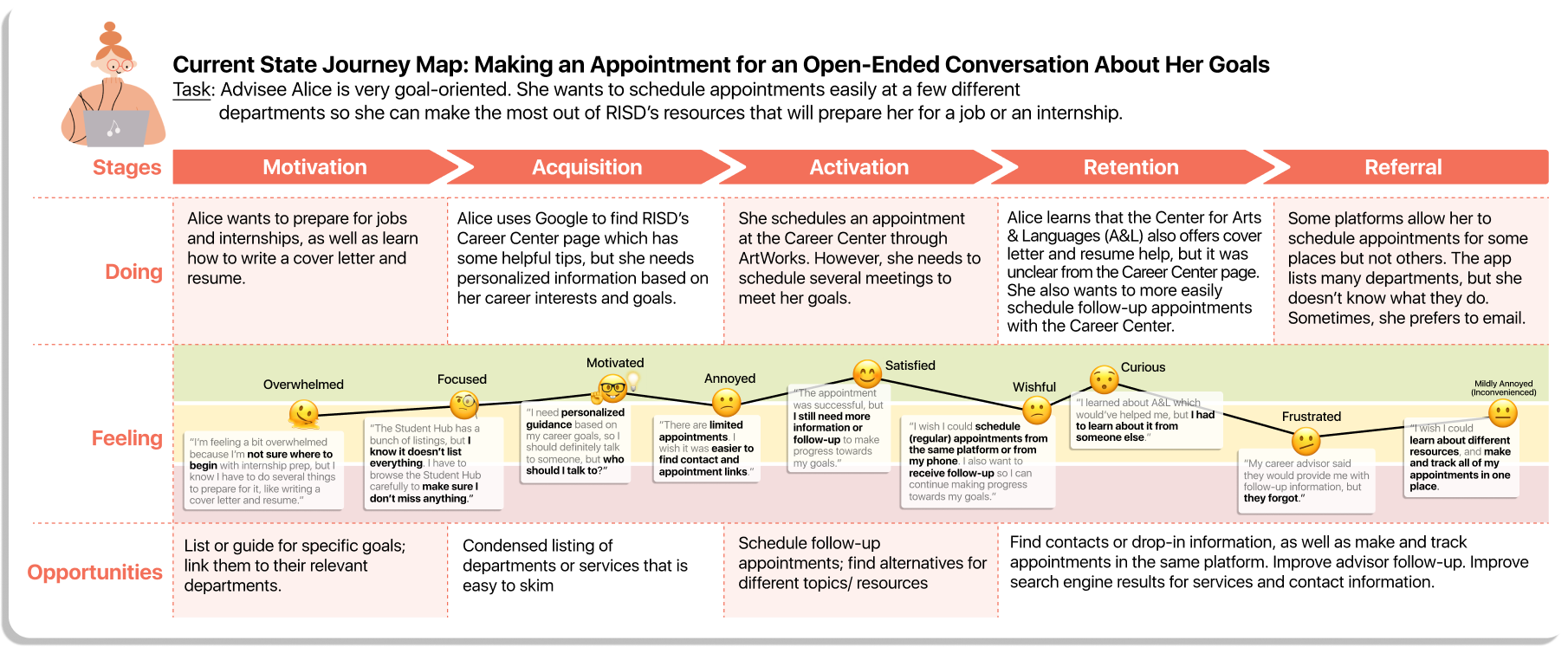
To empathize with my users, I developed a current state user journey map to understand their emotions and relationship finding contact information, their contexts, and identify opportunities for improvement or competitive advantages.
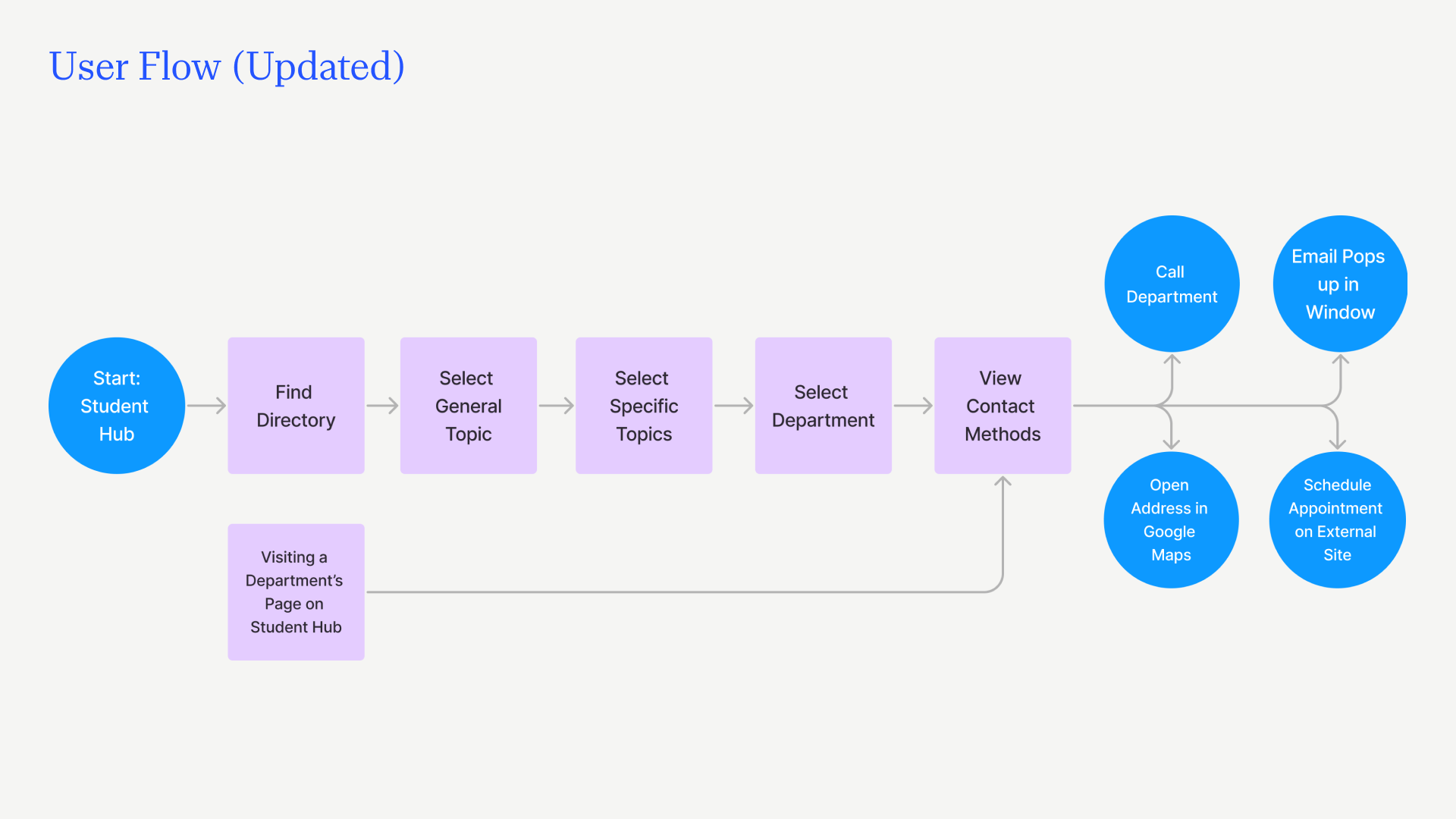
I drew some preliminary sketches based on my problem statement. After mapping out the user flow based on a sketch, I refined it into a final sketch which is shown below.
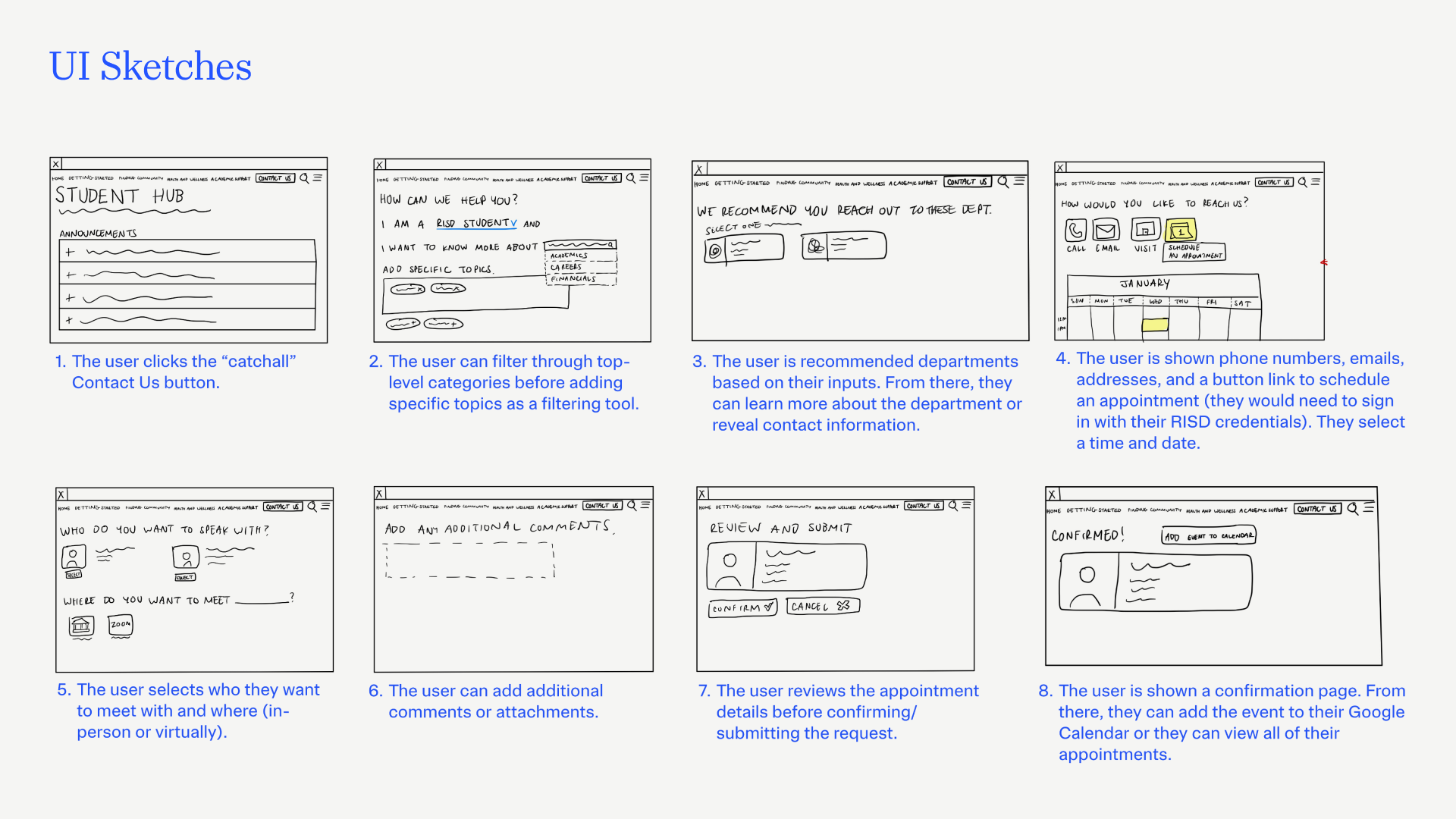
In summary, users will select filters for topics they are interested in discussing. Based on their selections, they will be recommended different departments they can contact, upon which they can learn more about the department and receive phone numbers, emails, addresses, and appointment scheduling links.
Ideally, students would be able to schedule their appointments in one platform. After stakeholder feedback from the RISD Digital Experience Team, however, I decided to hold off on an appointment platform. For now, the appointment section would just link to the appropriate page or platform. A single appointments platform is complicated by the needs and workflows of the individual departments at RISD.
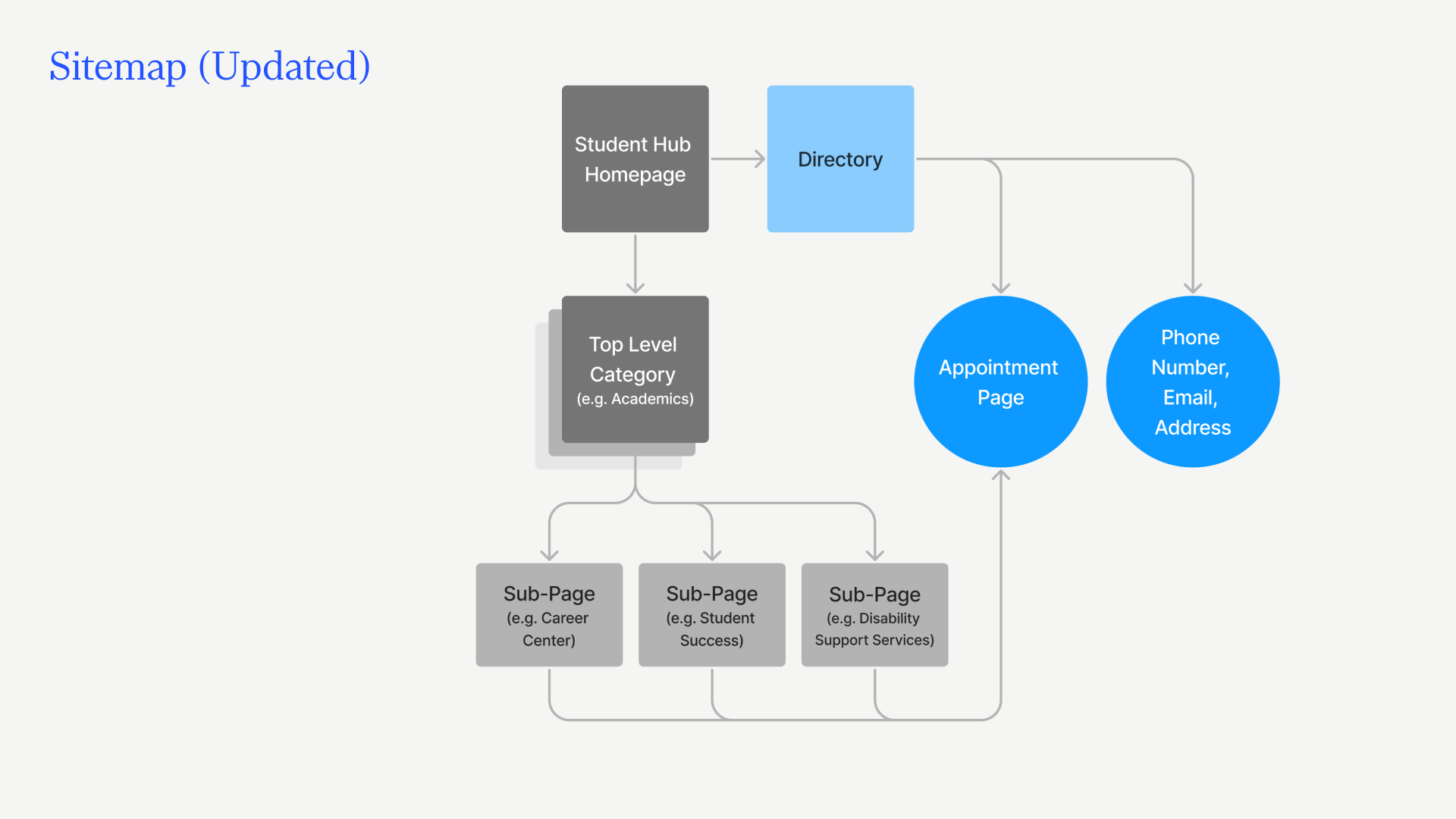
The sitemap is a critical artifact for guiding the information architecture of the contact filtering feature. There many departments and offices at RISD which could be further divided into several categories and subcategories. I tried to divide them so that they aren’t too general or so specific that the options overwhelm users.
Below is a condensed version of the sitemap; the stacked squares connotes categories and subcategories.
The proposed user flow would be accessible starting from the top-level of the website. All pages and subpages would have a button that jumps to the appointment page OR section of this proposed user flow unless they do not offer appointments.
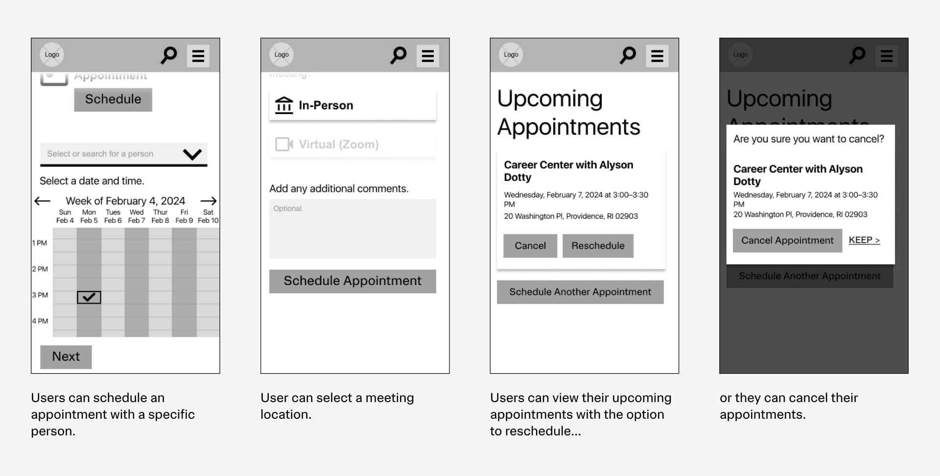
After developing and prototyping wireframes, I conducted usability tests with five users. I asked them to complete three tasks: schedule an appointment for career guidance, reschedule the appointment, and then cancel it.
The most important findings:
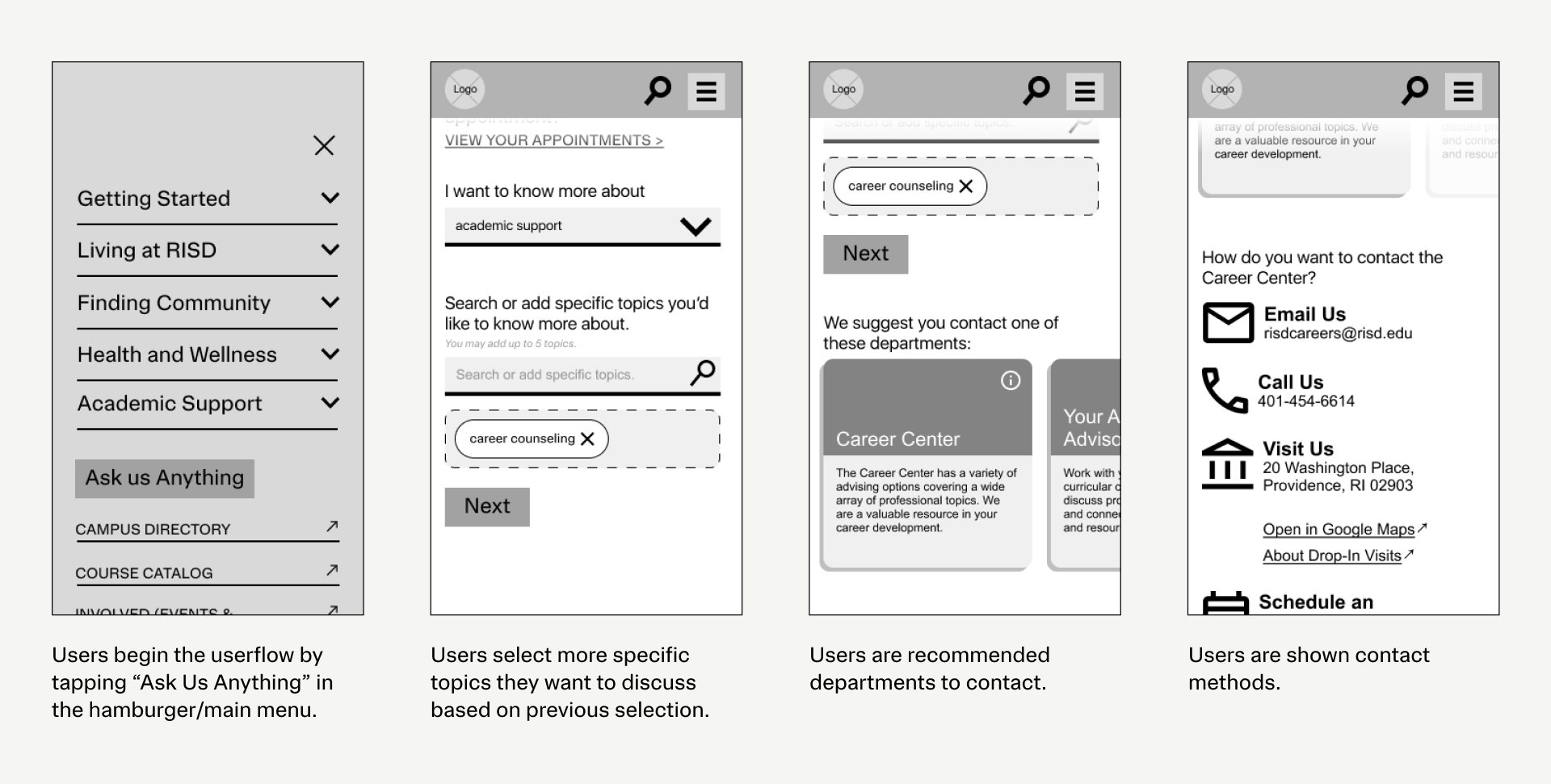
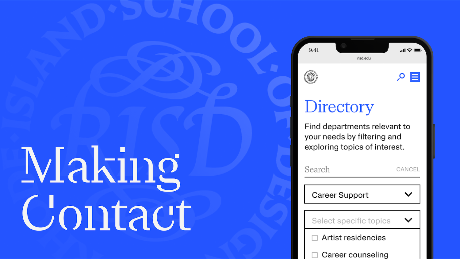
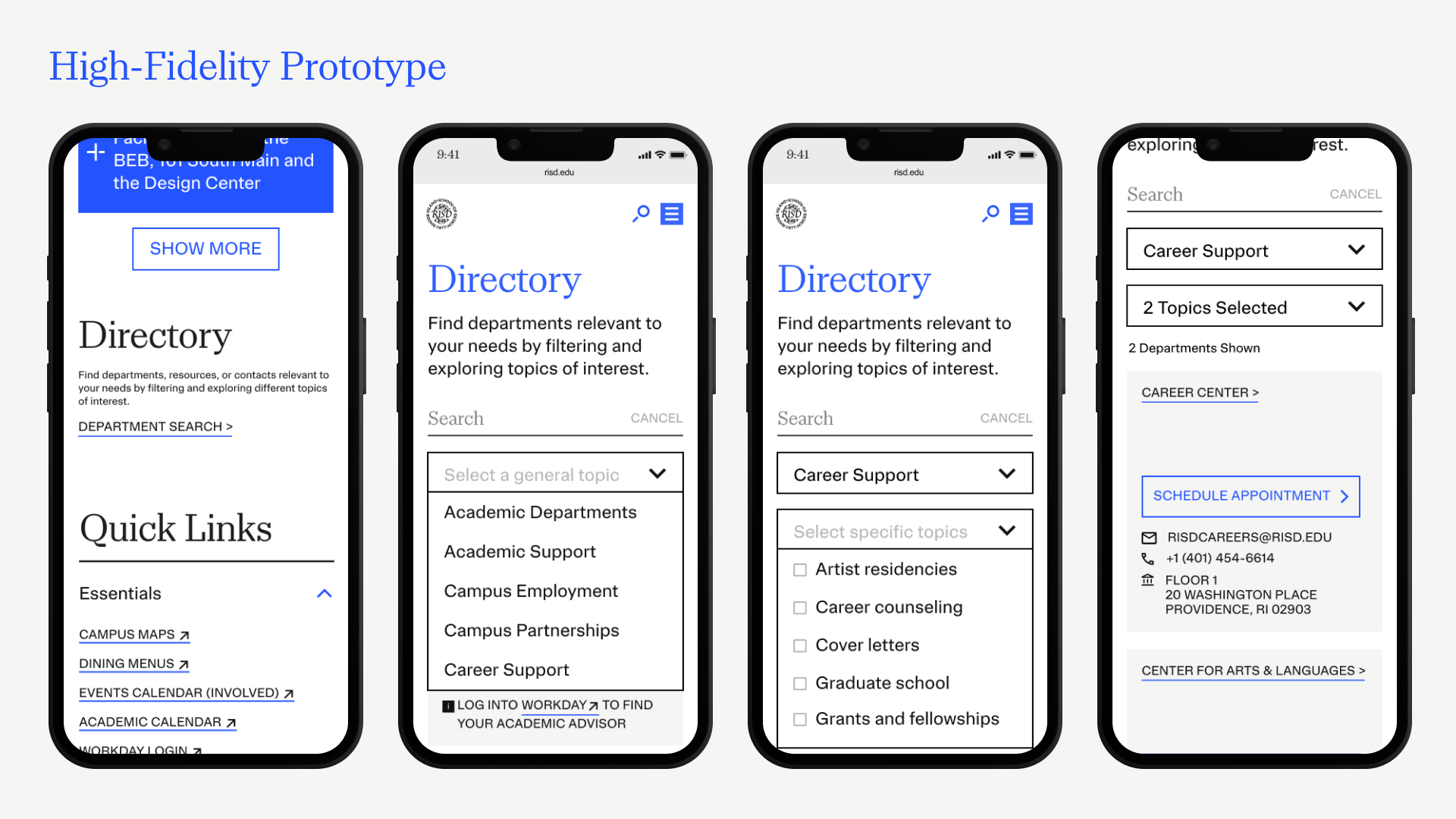
With feedback gathered from the usability tests, I developed high-fidelity prototype. This prototype introduces a new "filtering" concept, where users can filter for departments based on general and specific topics.
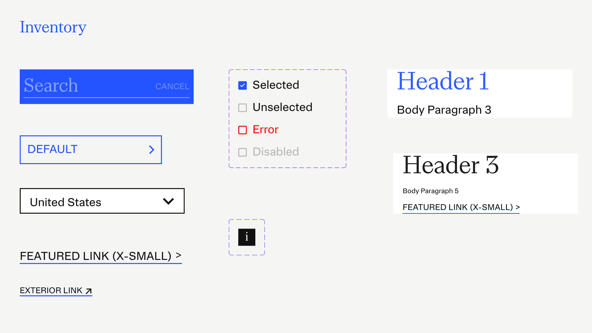
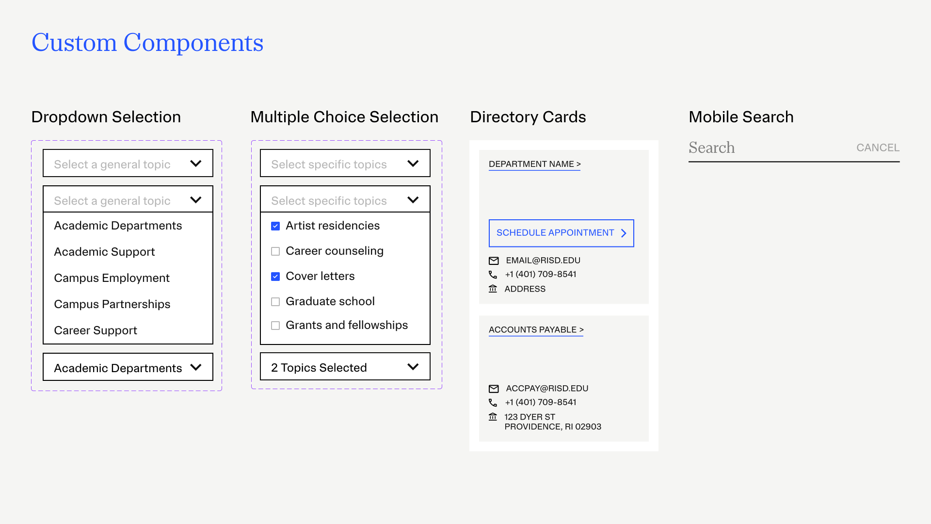
The Inventory slide lists all of the components being used from RISD's existing design system. The Custom Components slide lists new components I've created and proposed for this design.
I presented my work to RISD's Digital Experience team, the course instructor, and the teaching assistant who all provided really helpful feedback and food for thought that should be factored into future designs:
Regarding next steps: